Crafting the new brand
Hemisphere Energy Corporation is a Canadian oil company focused on sustainable growth of its high netback, low decline conventional heavy oil assets through enhanced recovery methods.
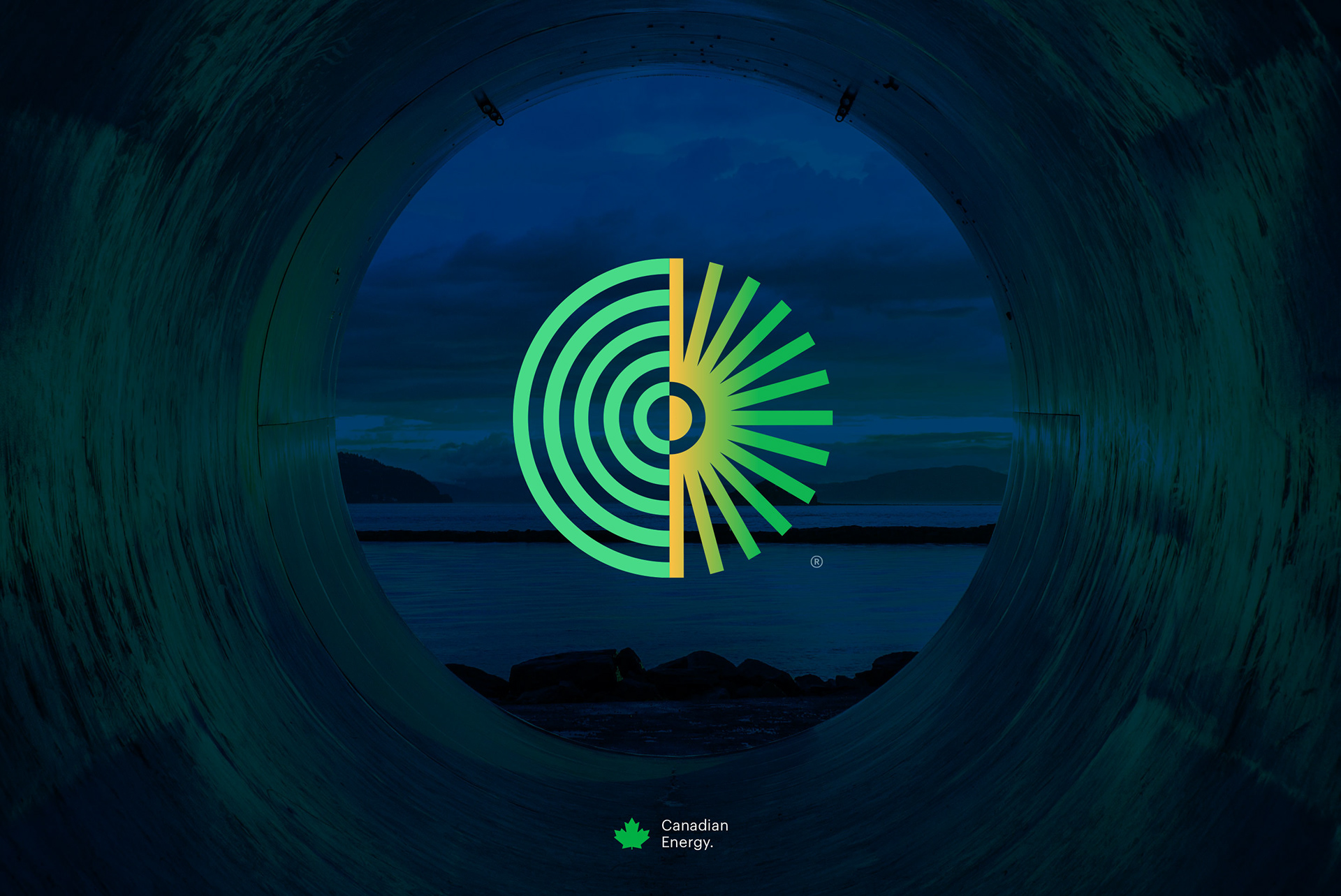
The strategy behind the new brand was that of encompassing the companies name, service, values and industry into a single symbol. The circular logo divided into two parts, or 'hemispheres', was purposely and thoughtfully crafted with energy and half-circles in mind.
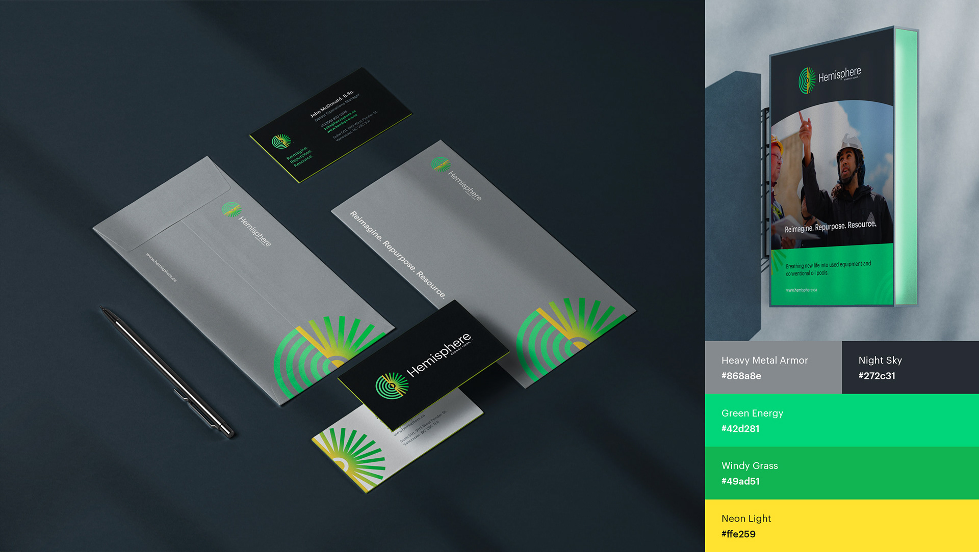
The colour palette was chosen from the iconic northern lights, and fits right into the industries roots in northern Canada.